![]()
Cuestión de Oficio | A Matter of Tecnique
Exposición Individual MONOCROMO
Galería ANIMAL
Por Paz Castañeda
Veladura: capa de color transparente que se aplica sobre otra capa de pintura ya seca para modificar su grado de luminosidad o color.
Negro óptico o cromático: mezcla de colores que, sin incluir el pigmento negro, son percibidos como un negro. La sensación que produce este color es de mayor profundidad y posibilidad de matices, cualidades que lo alejan del negro plano y gráfico.
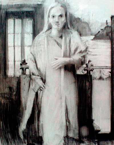
El nuevo trabajo de Ximena Cousiño se presenta como una derivación muy natural de su exposición anterior (Museo de Arte Contemporáneo, 2005). En grandes formatos de lino crudo la artista retrató en esa ocasión a niños en proporciones monumentales, trabajando sólo con carbón y con fondos planos que no entregaban información espacial. Se trataba de un trabajo sobre la figura mediante la construcción de arquetipos que sugerían una mínima ambientación: mediante el disfraz, los enormes niños se presentaban como una galería de personajes, crudos y sombríos por el tamaño y el tratamiento del carboncillo, figuras mas bien volátiles (por la ausencia o abstracción del fondo), como si estuvieran a medio camino entre el imaginario infantil y otro más dramático. En este nuevo proyecto, que se ve similar al anterior a primera vista, la artista hace, sin embargo, dos operaciones contrarias a las ya trabajadas en su exposición anterior. Primero, suprimir o subordinar la figura humana para hacer aparecer los fondos, los espacios en que circulan personajes sin identidad reconocible.
Segundo, pasar del dibujo al óleo, lo cual supone pasar de un medio gráfico a uno pictórico, de lo seco a lo húmedo, de lo acromático al color. ¿Cómo es posible hacer un cambio radical y que, sin embargo, ambos proyectos mantengan una relación de coherencia y fluidez? Habría que decir que la transición está hecha, en la exposición previa de retratos infantiles, por el uso del carboncillo de una manera más bien pictórica, es decir, no utilizándolo desde la construcción lineal, sino como manchas de carbón que armaban la figura desde los distintos valores que presentaba el modelo (sombra, media tinta y luz). Pero más allá de esta consideración, la conexión entre ambos trabajos está dada por el uso del negro y su restricción voluntariosa de excluir el color local como recurso de representación realista o de carga expresiva.
.Mantener el negro fue una decisión en teoría. En la práctica, pasar del negro propio del carboncillo al negro en pintura implicó revisar las posibilidades que da el óleo y elegir aquella que potenciara la idea de este nuevo proyecto: no representar figuras, y ni siquiera espacios, sino atmósferas. Fue en este sentido que el negroóptico -como tinta- y la veladura -como sistema- se presentaron como opciones materiales. No fueron elegidos por ser recursos tradicionales de la “buena pintura” o “pintura académica”, sino porque permitían ambientar más que describir ilustrativamente el modelo y porque, gracias a la sutileza cromática y al rigor silencioso de la ejecución, también permitían hacer el paso fluido de un trabajo a otro dentro de la obra de la artista.
El Oficio de la Veladura
En la pintura actual, la veladura parece una herramienta
extemporánea. La lentitud de su proceso,
más la asociación que se hace de ella a una convención
ya superada, la han desacreditado como
recurso eficiente y la han relegado a una cuestión
de oficio predecimonónica. Manet, precursor de
la pintura moderna a mediados del siglo XIX, se
encargó de cuestionar la tradición eliminando la
veladura para acusar lo plano en el cuadro y su
determinación causó escándalo porque, justamente,
la ausencia de veladura mostraba una
ejecución menos acabada, más “torpe” y menos
realista por la pérdida de profundidad espacial.
Digo “justamente” porque la veladura, desde sus
inicios, fue establecida como la gran posibilidad
de producir una ilusión de tridimensionalidad
más fiel a la realidad, no sólo porque permite la
representación de infinitos grados de sombra
–y, por lo tanto, el modelado volumétrico de las
formas-, sino porque integra la figura y el fondo
en una relación de coherencia y participación, a la
manera en que el aire que circula entre los cuerpos
relaciona una cosa con otra en el mundo real.
El uso de la veladura se estableció con la invención del óleo, adjudicada al pintor flamenco Jan Van Eyck en el siglo XV. Hasta entonces, la técnica del fresco y el temple habían determinado la representación a partir de sus limitaciones: el secado rápido restringía la manipulación de la pintura y las posibilidades de transparencia eran mínimas. La aparición del óleo marcó un cambio en la representación mimética: sus aglutinantes y solventes (trementina y aceite) permitían trabajar más lentamente y daban a la pintura una amplitud desconocida, desde la transparencia absoluta hasta lo cubriente y empastado. La semejanza con el modelo real se acentuó en la representación pictórica en la medida en que estos recursos materiales del óleo permitían reproducir mejor el volumen y el peso de los cuerpos, la luz en todas sus variaciones y el fenómeno de apertura de las formas por la incidencia de la luz en ellas. La transparencia de la veladura se estableció primero como un recurso de sombreado, que caracterizó las obras de Da Vinci, y tuvo su apogeo en el claroscuro de Caravaggio. Las mútiples capas de pintura transparente, aplicadas una sobre otra, tanto una sombra rotunda cercana al negro como valores intermedios muy sutiles. Las figuras se abrieron al fondo hasta perderse en él, en atmósferas dramatizadas por la oposición de luz y sombra, y sin embargo, muy realistas a nivel de percepción.
La veladura, por ser precisamente un velo, exaltaba esa sensación de realismo porque, desde su ejecución, se parece a la sombra que cae como un velo sobre los cuerpos, cubriéndolos pero dejándolos ver. Luego, la veladura fue aprovechada en sus dos dimensiones: cambio de valor y cambio cromático. En una síntesis histórica muy breve: primero por la escuela veneciana y principalmente por Tiziano que en su última etapa creó riquísimas carnaciones, luego por Velázquez que aprovechó la veladura como recurso de máxima economía para producir atmósferas y por Rembrandt, que tensionó la veladura colorida con grandes empastes.
El neoclasicisismo de David e Ingres retomaron la veladura en su sentido más tradicional y desde entonces quedó establecida como recurso académico, regido por convenciones rígidas que determinaban, por ejemplo, que una veladura parda debía cubrir la generalidad de un paisaje, para integrar todos los elementos en un espacio unitario pero también para ennoblecer al género menor del paisaje a través de una atmósfera “elegante”, más parecida a los cuadros de representaciones históricas o mitológicas. Esos acuerdos académicos fueron los que terminaron por sepultar a la veladura como un recurso inerte y anticuado a los ojos de los artistas del siglo XIX.
Hoy, dos siglos más tarde, no sólo persiste esa idea (y, en general, sólo se utiliza la veladura de buena forma en las operaciones conceptuales de cita a la tradición pictórica), sino también juega en contra la dificultad técnica que implica la veladura y que parece no calzar con los tiempos de producción actuales. Trabajar con veladuras requiere respetar el tiempo lento del óleo y aplicarse pacientemente a la ejecución limpia y prolija de múltiples transparencias, Ximena Cousiño recurre a esa fórmula, pero también a exploraciones cromáticas propias, donde además de los colores primarios aparecen los tierras, el azul de Prusia, el magenta, el violeta… A veces mezclados en la paleta y otras en la tela, donde una capa de color más saturado aplaca el colorido de la anterior.
Es por eso que todas las pinturas de esta exposición tienen matices diferentes, pero un mismo origen y fin: producir en el ojo la sensación de negro. El trabajo en estas obras es una cuestión de oficio. La lección aprendida de algo que cuesta tanto enseñar: las sombras no son negras, las luces no son blancas. Todos los colores están contenidos en el modelo; la tarea del pintor es equilibrar su participación en el cuadro. En este caso, significa amarrarse las manos y restringir el color para que todo se muestre como negro (sin estar presente ese pigmento más que en el carboncillo del bosquejo) y para que, a pesar de la negrura general, haya en la pintura luces y medias tintas. Cada cuadro es una sutil modulación del negro a nivel cromático y también de luminosidad. En algunos muy oscuros apenas se dejan ver los componentes de la escena; en otros, un marcado claroscuro envuelve el espacio esperando a que cada capa esté seca. Esa suma de tiempo contradice la producción instantánea de imágenes a que estamos acostumbrados, ya sea apretando el power del televisor o imprimiendo una foto casera.
Tiempo acumulado es actualmente pérdida de tiempo, según las convenciones de producción, pero en las obras de esta exposición esa fórmula revierte su sentido: la suma de lentitud potencia la profundidad, no sólo en el sentido de la representación mimética (que se traduce a un logrado realismo del modelo), sino también profundidad al interior del cuadro, ya que la superposición de transparencias densifica gradualmente la atmósfera y las distintas capas de negro aumentan la riqueza cromática de la imagen.
Un negro que no es negro
En estas pinturas, el negro de cada capa es
distinto al anterior. El negro óptico, según la
receta tradicional de la teoría del color, proviene
de la mezcla de los tres colores primarios
(amarillo, rojo y azul) que, en su acumulación
de pigmentos, terminan por anular la pureza de
cada color -su intensidad o brillo- hasta desparecer
en un negro en el que se ha fugado la luz.
doméstico con un tono dramático que habla
más de lo extraordinario que de lo ordinario;
o una luminosidad clara y dispersa muestra
los objetos cotidianos como si en el cuadro
se capturara un momento de revelación.
Sin embargo, esas interpretaciones emocionales
no fueron las que guiaron el trabajo pictórico de
Ximena Cousiño. Su intención siempre se ajustó
a los intereses plásticos, obligándola a estar muy
atenta a cuándo cubrir con otra capa de veladura,
cuándo resguardar la luz inicial, cuándo virar el
color hacia un matiz o mantenerlo en una neutralidad
grisácea. En definitiva, cuándo tapar o cuándo
dejar ver, procesos que se relacionan con la acepción
de “velo” como recurso de ocultamiento y de
“velar” como borrar (en el caso de la fotografía).
Otra acepción de “velar” calza también con
los procedimientos de estas obras: velar como
vigilar o cuidar. Las veladuras le exigen a la
artista vigilar atentamente la pulcritud y cuidado
de las operaciones pictóricas. Y además las
veladuras le permiten registrar espacios privados,
provenientes de su imaginario biográfico,
resguardando la intimidad de ellos a través de
la ambigüedad atmosférica en la que se disuelven.
Así, estos pequeños recortes de escenarios
y escenas, tan pequeños en su encuadre que
impiden la lectura global de un espacio, son
además velados por ella, mantenidos a distancia
de la clasificación anecdótica y son, por efecto
de la pintura, sólo clasificables como pintura.
Paz Castañeda
Paz Castañeda es Licenciada en Bellas Artes con Mención Pintura de la Universidad ARCIS, donde actualmente se desempeña como Profesora de Pintura y Taller de Tesis. Anteriormente estudió Periodismo en la Universidad de Chile. En el 2001 realiza la exposición individual “OTRA (Autorretratos)” en el Museo de Arte Contemporáneo de Santiago. Este proyecto se exhibe también en el Museo de Arte Contemporáneo de Valdivia (2001) y la Sala de la Universidad de Concepción (2002). En el 2002 realiza la muestra individual “Hay mujeres que parecen hechas a mano”, en el Centro de Extensión de la Universidad Católica de Santiago. En el 2005 es invitada para organizar la exposición colectiva “Mimesis. Nuevo Realismo”, en Galería Cecilia Palma, Santiago. En el 2006 participa en la exposiciones colectivas “Retratos de Sociedad” en Galería Cecilia Palma; “Escenario”, muestra de artistas chilenos en Lima; y “Del otro lado. Arte contemporáneo de mujeres en Chile”, en el Centro Cultural Palacio de La Moneda. Ha recibido el financiamiento de FONDART en dos oportunidades y actualmente prepara un proyecto de intervención en el Metro de Santiago. Paz Castañeda se ha desempeñado como docente en la Universidad ARCIS, UNIACC y Universidad Católica de Santiago.
A Matter of Technique | Cuestión de Oficio
MONOCROMO Individual Exposition
Galería ANIMAL, Santiago
By Paz Castañeda
Translation Niel Davidson
Glaze: layer of transparent colour applied to a layer of dry paint to alter its level of luminosity or colour.
Chromatic black: a mixture of colours that is perceived as black, even though it does not include black pigment. This colour is differentiated from plain black by a greater feeling of depth and increased potential for shading.
Ximena Cousiño’s new work appears to follow on very naturally from her previous exhibition (Museo de Arte Contemporáneo, 2005). On that occasion, the artist employed raw canvas in large formats to portray children of monumental proportions, working only with charcoal and unrelieved backgrounds that provided no spatial information. This figure work involved the construction of archetypes conveying a minimum of background: the enormous children were presented in disguise to form a gallery of characters, stark and sombre because of their size and the charcoal treatment, and given a certain volatility by the absence or abstraction of the setting, as though placed midway between a child’s worldview and a more dramatic one. At first sight this latest project looks similar to the previous one, but the artist carries out two operations that create a contrast with the earlier exhibition. First, she suppresses or subordinates the human figure to bring out the backgrounds, through which move characters lacking in any recognisable identity.
Second,she replaces drawing with oil painting, thereby switching from a graphic medium to a pictorial one, dry to moist, achromatism to colour. How can she have succeeded in making a radical change whilst retaining a consistent, fluid relationship between the two projects? The answer is that she made the transition in the earlier exhibition of children’s portraits by using charcoal in a rather pictorial way, eschewing line drawing in favour of areas of shading that constructed the figure from the different values presented by the model (shadow, half-tones and light). This consideration aside, though, the connection between the two series of work lies in the use of black and the deliberate exclusion of local colour as a means of achieving realistic representation or expressiveness. Retaining the blackness was a theoretical decision. In practice, moving from the black of charcoal to blackness in painting meant reviewing the possibilities offered by oils and choosing the one that would most strongly bring out the idea behind this new project: that of representing not figures, or even spaces, but atmospheres. It was for this reason that chromatic black (as a cast) and glazing (as a system) were identified as technical options. They were not chosen because they were traditional mainstays of “good painting” or “academic painting”, but because they allowed the model to be evoked rather than explicitly portrayed and because, given the chromatic subtlety and understated rigour of the execution, they also provided a fluid transition from one body of work to another within the artist’s output.
The technique of glazing
En Glazing is not seen as contemporary by
today’s painters. The time it takes and the
perception that it is an outworn convention
have discredited it as a useful resource
and relegated it to the status of a prenineteenth
century technique. Manet, a
precursor of modern painting in the middle
part of that century, set out to challenge
tradition by rejecting the technique in order
to bring out the flatness in the picture.
His decision caused an uproar for the very
reason that the lack of glazing resulted in
a less finished, “clumsier” and less realistic
execution owing to the loss of spatial depth.
I say “for the very reason” because glazing
became established right from the outset
as an excellent way of producing an illusion
of three-dimensionality that was closer to
reality, not only because it can be used to
represent infinite shades, and thus to model
forms volumetrically, but also because it
integrates figure and background by creating
a coherent, participatory relationship, just
as the air circulating between bodies relates
one thing to another in the real world.
The use of glazing was established with the invention of oil painting, attributed to the Flemish painter Jan Van Eyck in the fifteenth century. Up until then, the limitations of fresco and tempera technique had determined the form of representation: rapid drying made the paint hard to work, and there was very little scope for transparency effects. The appearance of oil paint marked a shift in mimetic representation: its binders and solvents (turpentine and oil) allowed artists to work more slowly and provided them with an unprecedented range of application effects, from complete transparency to a full coating. The resemblance to the real model was heightened in pictorial representation because these characteristics of oil allowed for better reproduction of the volume and weight of bodies, light in all its variations and the opening up of forms by the way they are lit. Transparent glazing was first established as a shading resource, and it characterized Da Vinci’s works before reaching its culmination in Caravaggio’s chiaroscuro. Multiple layers of transparent paint, applied one on top of another, produced both a full shade close to black and very subtle intermediate values. Figures were opened up to the background until they merged with it, in atmospheres that were dramatized by the opposition of light and shade and yet were perceived as highly realistic.
Glazing heightened this feeling of realism because in its execution it acts like a shadow falling upon the bodies represented, covering them while still allowing them to be seen. Both the potential uses of glazing – to change values and to change colours – were subsequently taken advantage of. To give a very brief historical summary, it was employed first by the Venetian school, chiefly Titian, who used it to create very rich flesh tones in his final years, then by Velázquez, who used it as a highly economical resource for creating atmospheres, and by Rembrandt, who set off coloured glazes against large areas of full coating.
The neoclassical school of David and Ingres returned to the more traditional type of glazing, whereupon it became entrenched as an academic resource governed by rigid conventions establishing, for example, that a greyish-brown glaze should cover the whole of a landscape to bind all its elements into a unitary whole but also to ennoble this minor genre by creating an “elegant” atmosphere more akin to that of pictures representing scenes from history or mythology.
It was this academic consensus that ultimately doomed glazing to be seen as an inert, antiquated resource by nineteenth century artists. Now, two centuries later, not only does this idea linger (generally speaking, properly executed glazing is only found in conceptual operations citing the painting tradition), but the technical difficulty involved in glazing also tells against it, as it seems incompatible with the pace of current production. Working with glazes means adapting to the slow pace of oil painting and patiently undertaking numerous neat, clean transparencies, waiting for each layer to dry before applying the next. The total time required contrasts with the instantaneousness of the images we are used to obtaining by turning on the television or printing out a photograph we have just taken. This cumulative effort is seen as a waste of time by today’s standards of production, but in the present exhibition this view is turned on its head: the accumulation of slow operations enhances depth, in terms not only of mimetic representation (where it translates into fidelity to the model) but also of depth within the picture, since the overlaying of transparencies gradually thickens the atmosphere and the different layers of black intensify the chromatic richness of the image.
A black that is no black
EIn these pictures of Ximena Cousiño’s,
a different black is used at each stage.
According to the traditional prescription
of colour theory, chromatic black comes
from mixing the three primary colours
(yellow, red and blue), the accumulation
of pigments eventually cancelling out
the purity of each colour – its intensity or
brightness – until they merge into a blackness
from which all light has been expelled.
Cousiño uses this formula but also conducts
her own explorations, so that the primary
colours are supplemented by earths, Prussian
blue, magenta, violet and others, sometimes
mixed on the palette and sometimes on
the canvas, where a layer of more saturated
colour mutes the colouring of the layer
below. This is why all the paintings in this
exhibition differ in their shading but have the
same motivation and purpose: to create the
sensation of blackness in the onlooker’s eye.
What has gone into these paintings is a matter of technique, lessons learned about something that is so hard to teach: shadows are not black, lights are not white. All colours are contained in the model and the painter’s job is to balance them in the picture. In the present case, it meant the artist tying her own hands and restricting her use of colour so that everything appeared as black (even though that pigment is present only in the charcoal of the sketching) and so that, notwithstanding that general blackness, the picture contains lights and half-tones. Here, each picture is a subtle modulation of black, in terms of both colour and light. Some are very dark and the elements of the scene can hardly be made out; in others, a pronounced chiaroscuro imbues the domestic setting with a dramatic tone more suggestive of the extraordinary than the ordinary; or a clear, evenly dispersed luminosity reveals everyday objects as though what the picture were capturing was a moment of revelation.
It was not these emotional interpretations that guided Ximena Cousiño’s painting, however. Her intentions always centred on visual technique, so that she had to think very carefully about when to apply another coat of glaze, when to preserve the original light, when to develop a colour into a shade or maintain a greyish neutrality; in short, when to cover and when to leave in view. The use of glazing requires a great deal of care and delicacy in the artist’s operations. It also gives her the opportunity to record intimate areas of her own life as seen through memory, protecting their privacy by means of the atmospheric ambiguity into which they meld. Thus, these snippets of scenes and ambiences, so small within their setting that there can be no overall reading, are also masked by it, removed from the realm of anecdotal classification and, by the effect of painting, classifiable only in painting terms. In this series, as in her earlier work, Ximena Cousiño presents visible fragments of her own life story. Now more than ever, though, these are governed by the autonomy of the language of painting. It is the presence of the pictorial material that allows us, the observers, to view these biographical fragments as images capable of being shared, ethereal or evanescent situations in which everyone can recognize the darkness, half-light or luminescence of an inner life, of a memory more than of a specific place. These vertical pictures, whose fissure-like format gives them the feeling of an unguarded or oblique glimpse into reality, are more revealing of a mood than a geographical location, a time than a place, a wordless transparency open to the viewer’s own reading than the opacity of an author’s settled message.
Paz Castañeda